Inspired by yesterday’s photography In_tuition @ BLANKSPACE I have been routing around in my old digital drawers for some of the photographs I have taken in the past, which I consider to be worth sharing. A small number are waving their hands and crying me, me, me. Many of their even older, film-based ancestors are sadly sitting in envelopes and boxes under the bed waiting to be sorted and scanned. Over time it’ll be worth pulling out the best, and arranging them into categories, themes, series.
 |
| Martin Creed, Work No. 227 |
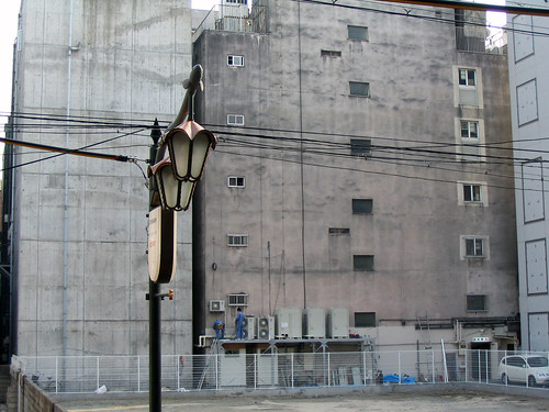
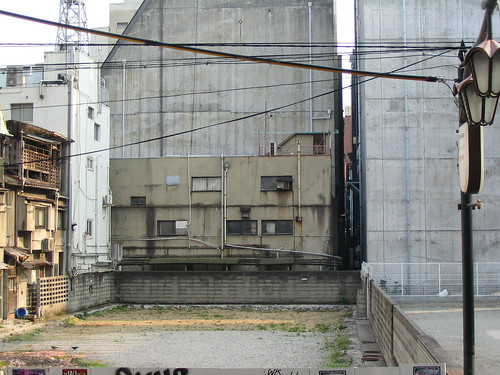
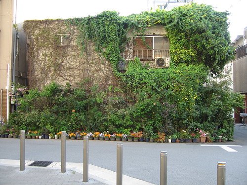
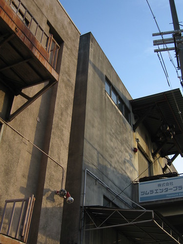
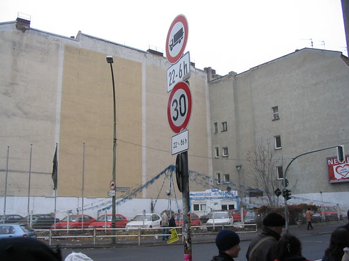
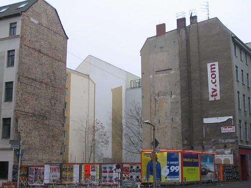
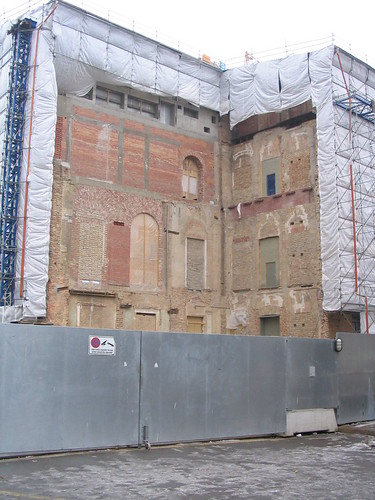
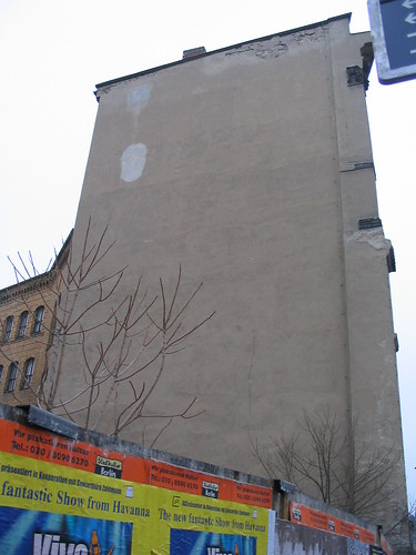
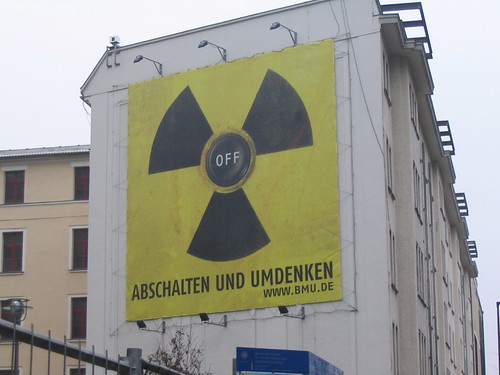
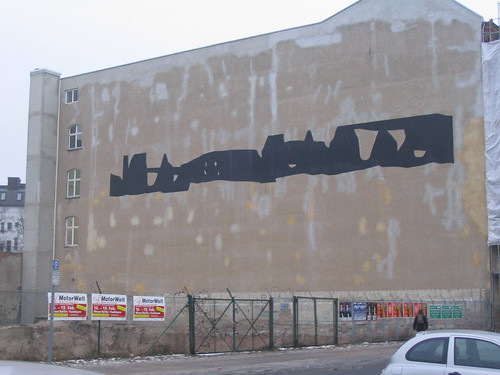
For now one obvious theme emerges, and that I will creatively name The Sides of Buildings, 2006-2007. I added the date to make it seem more important. The matter of fact descriptive title makes it sound like pure Conceptual Art (see Joseph Kosuth’s One and Three Chairs, Piero Manzoni’s Artist’s Shit, and Martin Creed’s Work No. 227, The Lights Going On And Off). I haven’t decided yet whether or not this series of photos is Conceptual Art, but when I do that decision is final. I do not delegate to anyone the privilege to say that’s not art. Anyone can say that’s shit art and be subjectively correct, but anyone stating that’s not art will always be objectively wrong.
 |
| Art & Language, Index 001 |
I’ve always liked Conceptual Art, and oddly enough I enjoy more for the way it looks than the so-called ideas behind the stuff. It’s all a load of old bollocks, but I’m glad it exists. I’m talking about traditional Conceptual Art, the stuff from the 60s and 70s; not using it as an umbrella term synonymous with contemporary art. The stuff which is all filing cabinets (Art & Language’s, Index 001), straight lines drawn on the wall (Sol LeWitt), and repetitive lines or typewritten text on plain white paper (Hanne Darboven or Robert Barry); that’s what I like. Your blood heads and your shark tanks are all well and good, but to make or buy these are expensive and labour intensive. But with old-school Conceptual Art if you want to own a representation of the idea you can usually make it yourself with a pencil and a ruler, a typewriter and a piece of paper, or a box of index cards.
There isn’t a real concept here, in The Sides of Buildings, 2006-2007, except for that I think they look good and when I took the first one (Berlin 01) I was happy and decided to carry on. Isn’t that how all art series get started, and also obsessive-compulsive disorders? I don’t know; my PhD has yet to arrive from that American mail order college.
Ahem, I now present to you The Sides of Buildings, 2006-2007, World Premiere exhibition. There’s coffee and cakes in the corner, no smoking in the toilet, wine will be served shortly. If you enjoy the show please leave a donation in the jar and a comment in the book. Come again; thank you, bye:
No comments:
Post a Comment